Alex Ma

This is a repository for my personal portfolio page.
Alex Ma 马天一’s Homepage
👋 Hello there, I’m Alex
I’m originally from China and came to the US for college in 2016. After getting a math degree, working for a unicorn startup in SF for a year and taking a career break, I’m now in school for a graduate degree in statistics to work on sustainability after graduation.
I love data science and AI and I’m always reading about them and applying them to solve various geospatial problems. In my spare time, I watch shows and eat out with my friends and husband.
‼️ News
Data Science Projects (click!)
🖼️ Pretty Pictures
Demographics of Income Class
In this project we experimented with using MLP and demographic data to predcit income class. Even with a basic task like this, the data could be very interesting. While plotting feature importance, I became curious to disentangle the correlation between the age and marital status feature. The graph shows the shocking fact that most widows across age groups earn less than 50k/year.
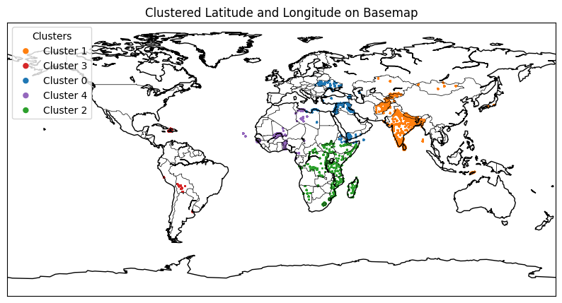
Wheat Price Time Series 2019 – 2022
This is a project I did to predict wheat price shock at the start of the Russian-Ukraine war. The dataset is on individual market-level and I did exploratory data analysis to understand the dataset. Here is what I found by clustering the latitude and longitude associated with each market.
After clustering the markets, now if we plot the average price for each cluster, we have the following graphs for wheat flour and imported wheat flour.
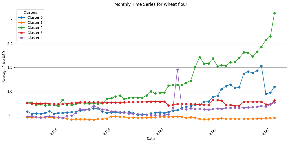
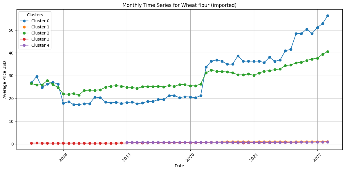
It shows that the price clearly differs within each geographical cluster. It shows that the markets associated with blue and green clusters have high prices for both commodity, which correspond to eatern european, middle eastern and south african countries.
Current v.s. Future Weather in the map
Based on a global climate map, I randomly picked a location and found the top 10 locations in the future of which their climates are most similar to the selected location’s climate right now based on the map. We have 3 variables for this map, which are mapped to the three visible light color channels, red for mean temp, green for isothermality, and blue for precipitation. Here, future locations are marked in purple and current location is marked in green blue.


Poverty Prediction Error Analysis
We attempted to predict poverity level using satellite image embedding. I created several plots to analyze model error.
This shows that Ridge Regression model actually gives much more nuanced, interesting predictions than an ANN MLP model.